


Uncover Hidden Colors Around You: Tips for Revealing Vibrant Hues in Everyday Photography
Master the Art of Seeing: Capture the Overlooked Tints and Shades That Make Photos Pop


Medium members read this story for free.
Color photography, like a game of find and seek, requires careful examination of the environment. Surprises can be found just about anywhere, from graffiti in the inner city to flowers in the natural world.
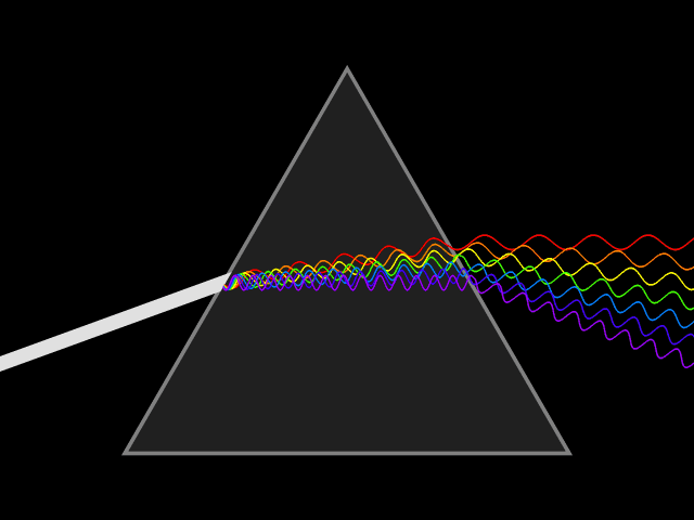
Knowing color is crucial for photographers to seek out wild combinations of tints, shades, and tones (see graphic below). Color is made by light interacting with objects and our eyes. To measure color in wavelengths requires a prism that bends light. When the prism bends light, the shorter wavelengths (when the waves are close together give you violets and blues. Long wavelengths (when the waves are far apart give you oranges and reds.
A color wheel is the key to color matching. You can use it to find colors that match (complement and contrast) each other. Colors opposite one another on the color wheel complement each other. For example, blue is the opposite of orange on the color wheel, so they are complementary or contrasting colors. These two colors produce a high-intensity effect when placed together in the frame of a photograph.

Blue and orange are handsome combinations when caught in all their glory, as in the image of California’s state flower, the California poppy. Look at the color wheel above and see they are directly across each other.
Keep reading with a 7-day free trial
Subscribe to Text and Image Substack to keep reading this post and get 7 days of free access to the full post archives.